Pet assistance | Donations
SAM'S HOPE
Pet assistance | Donations
SAM'S HOPE
Pet assistance | Donations
SAM'S HOPE
Pet assistance | Donations
SAM'S HOPE

OUTCOME
OUTCOME
OUTCOME
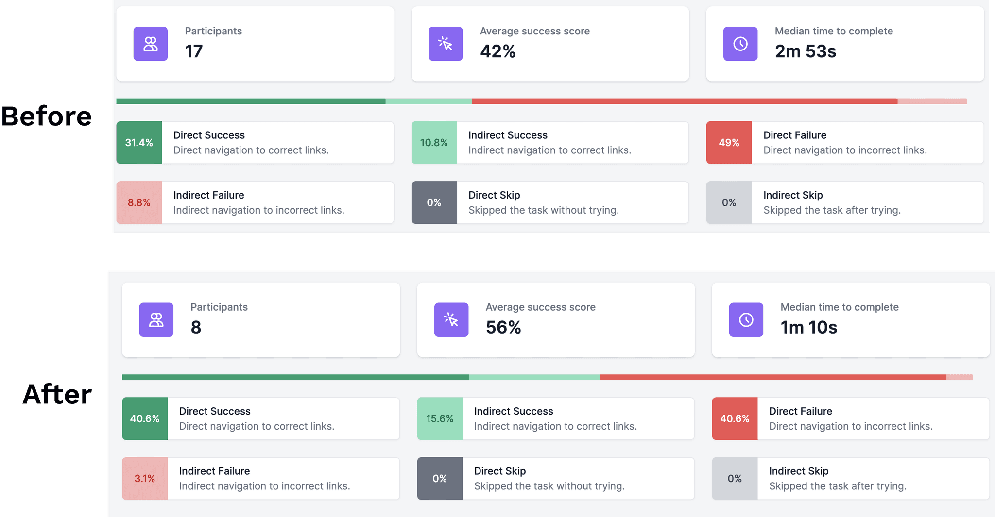
Improved user engagement: Boosted click-through rates by 14% and reduced bounce rates by 6% through targeted design enhancements based on comprehensive user research.
Enhanced navigation and satisfaction: Reduced misdirected customer interactions by 39% and improved overall user satisfaction by redesigning website navigation and structure.
Increased traffic: Achieved a 20% rise in traffic to previously overlooked website sections through effective usability testing and page revisions.
MY ROLE
MY ROLE
MY ROLE
Conducted user research: Identified key pain points through stakeholder and user interviews.
Analyzed and improved UX: Enhanced information architecture and user flows based on research findings.
Performed usability testing: Drafted usability test plans and scripts, validated design changes, and measured their impact on user engagement.
User Researcher
User Researcher
User Researcher
Tools
Tools
Tools
Miro
Figma
Adobe Creative Suite
Zoom Meetings
Miro
Figma
Adobe Creative Suite
Zoom Meetings
Miro
Figma
Adobe Creative Suite
Zoom Meetings
Miro
Figma
Adobe Creative Suite
Zoom Meetings
Web Designer
Web Designer
Web Designer
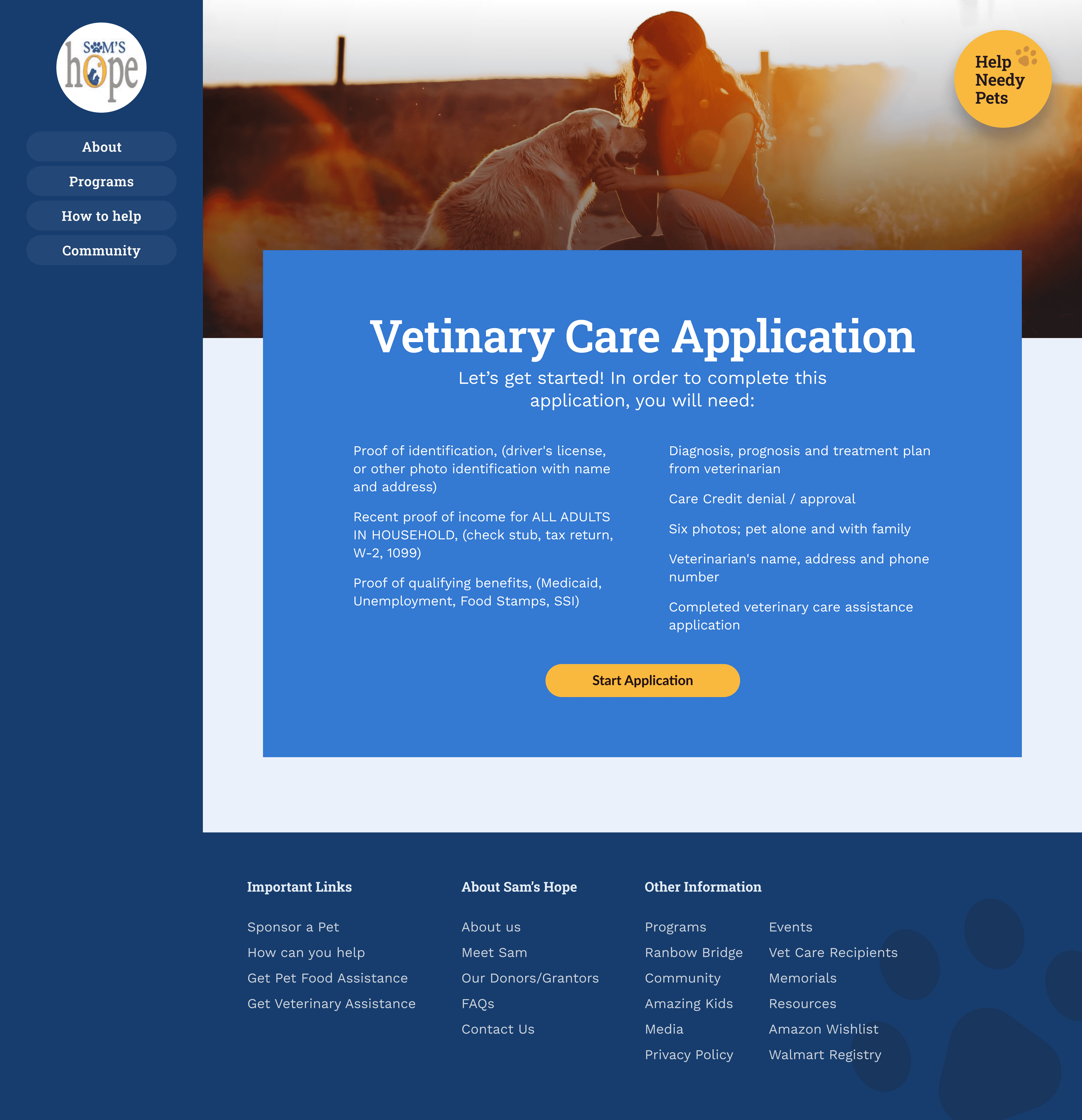
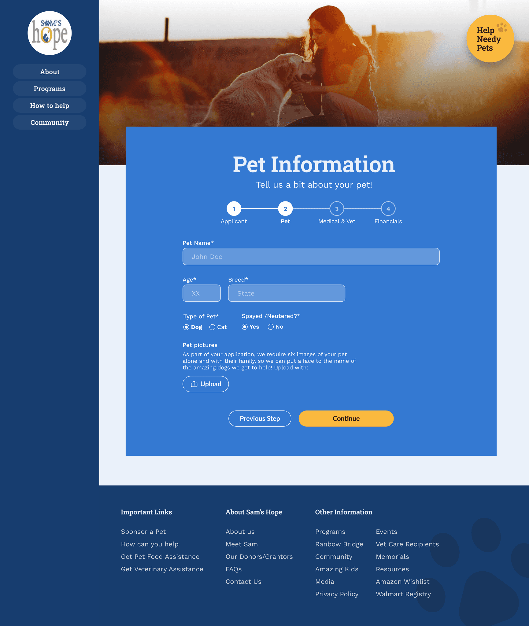
Created Hi-Fi wireframes and Prototype based on user insights, keeping the brand identity intact.
Created Hi-Fi wireframes and Prototype based on user insights, keeping the brand identity intact.
Created Hi-Fi wireframes and Prototype based on user insights, keeping the brand identity intact.
Created Hi-Fi wireframes and Prototype based on user insights, keeping the brand identity intact.
Team
Team
Team
Yash
Bishal
Gauri
Yash
Bishal
Gauri
Yash
Bishal
Gauri


THE CHALLENGE
THE CHALLENGE
THE CHALLENGE
Users faced challenges with determining service provider legitimacy, navigating
a confusing application process, and understanding poorly presented information,
making it difficult for them to find help and use the platform effectively.
Users faced challenges with determining service provider legitimacy, navigating
a confusing application process, and understanding poorly presented information,making it difficult for them to find help and use the platform effectively.
Users faced challenges with determining service provider legitimacy, navigating a confusing application process, and understanding poorly presented information, making it difficult for them to find help and use the platform effectively.
Users faced challenges with determining service provider legitimacy, navigating
a confusing application process, and understanding poorly presented information, making it difficult for them to find help and use the platform effectively.
NEW LOOK
NEW LOOK
NEW LOOK
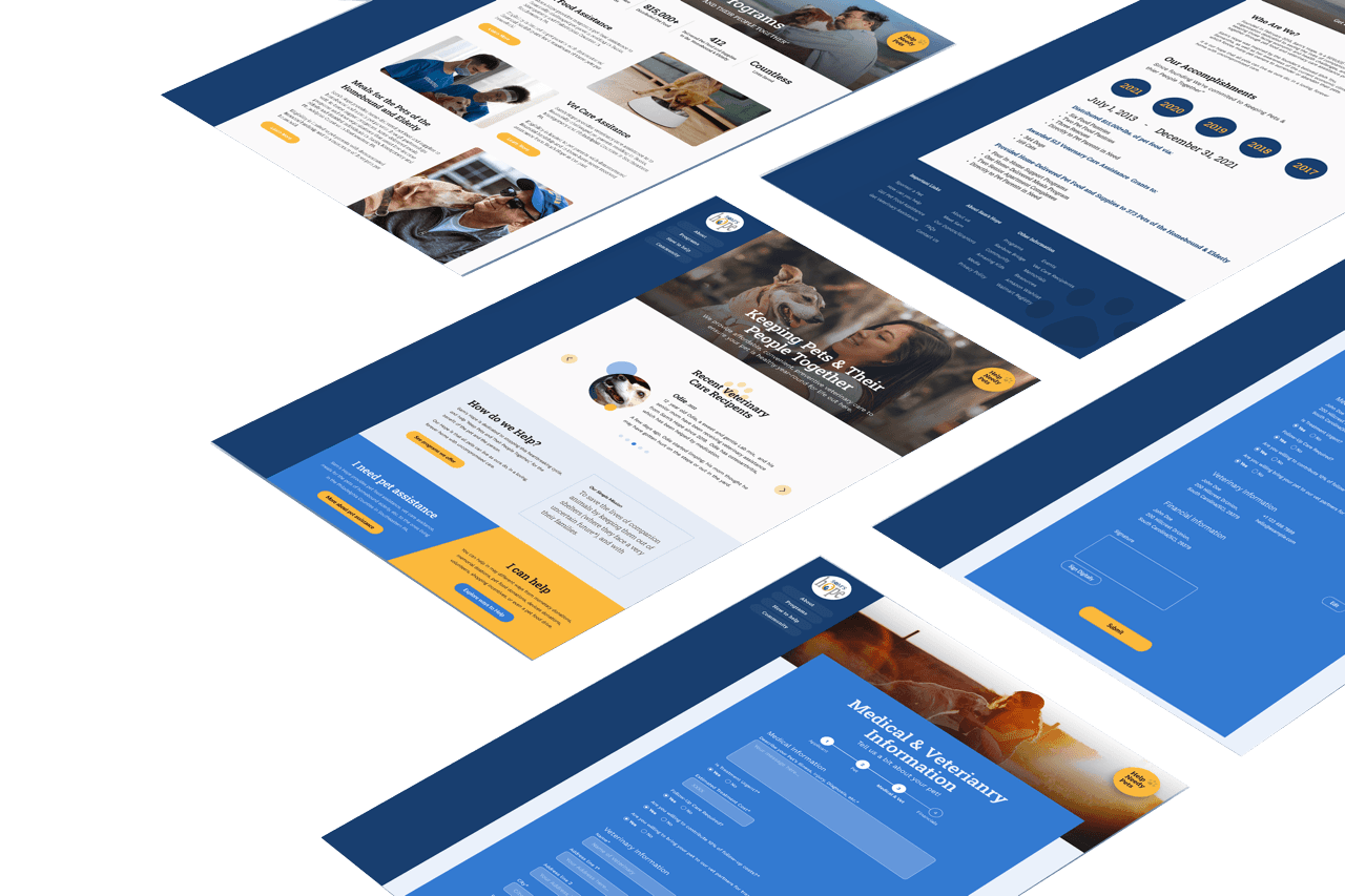
REVAMPED WEBSITE
REVAMPED WEBSITE
Streamlined an intuitive application procedure directly on our website.
Streamlined an intuitive application procedure directly on our website.
Streamlined an intuitive application procedure directly on our website.

Enhanced site and social connection through better UX writing
Enhanced site and social connection through better UX writing
Enhanced site and social connection through better UX writing

Content sorted
and simplified.
Content sorted
and simplified.
Content sorted
and simplified.

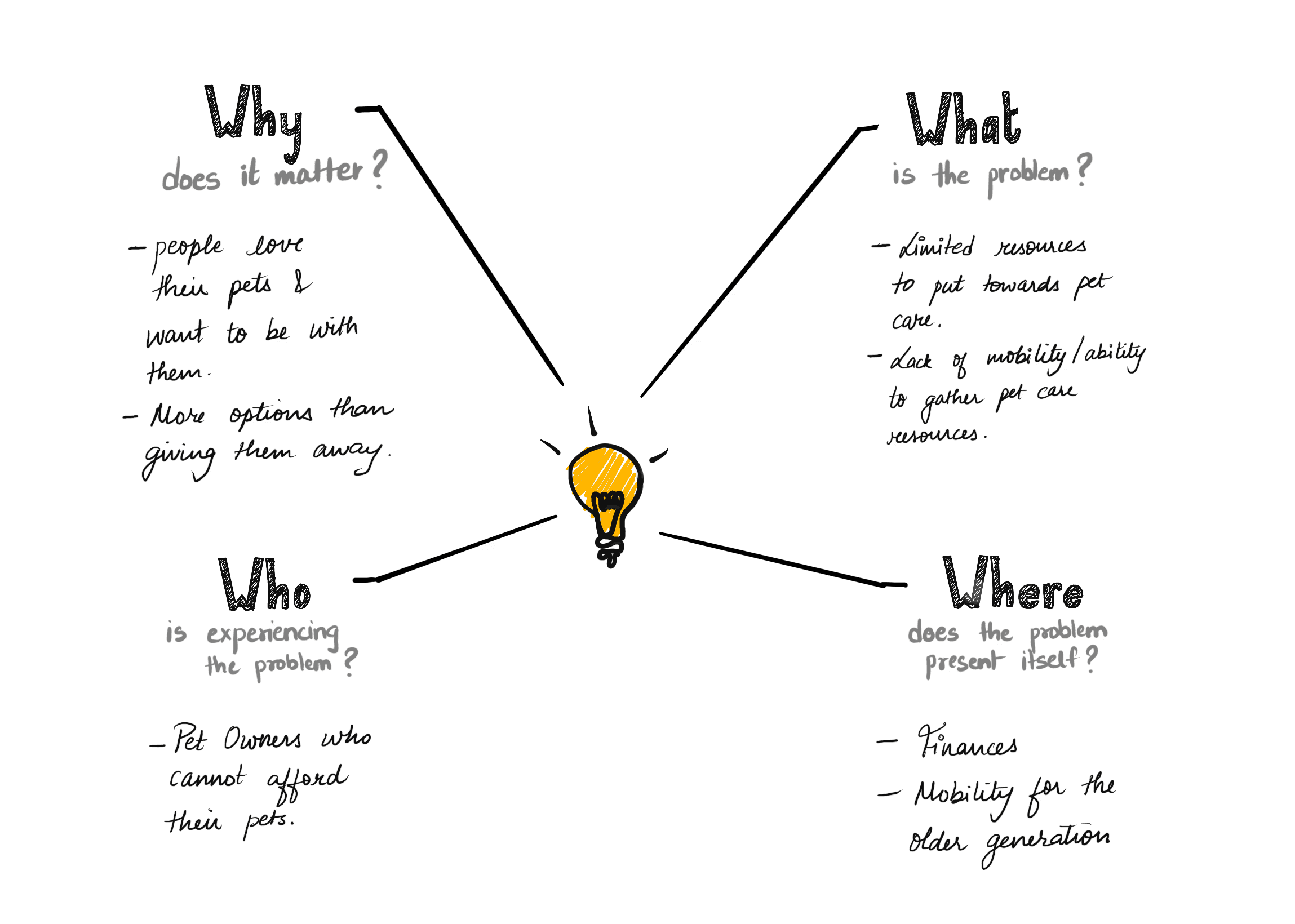
“Our pet owners who can't afford to take care of their pets because they have limited income (for various reasons). Our solution should allow users to financially support the user and their pet rather than giving up their pet.”
“Our pet owners who can't afford to take care of their pets because they have limited income (for various reasons). Our solution should allow users to financially support the user and their pet rather than giving up their pet.”
THE DISCOVERY
THE DISCOVERY
THE DISCOVERY
UNDERSTANDING THE PROBLEM
UNDERSTANDING THE PROBLEM
UNDERSTANDING THE PROBLEM
QUANTITATIVE RESEARCH
THE DISCOVERY
TREE TESTING
TREE TESTING
Tree testing was conducted on Sam's Hope's existing website with 17 participants, using assigned tasks to evaluate task success rates and completion times. The research uncovered significant challenges, particularly within the pet assistance application process, which showed a 64% failure rate.
I conducted tree testing on Sam's Hope's existing website with 17 participants, assigning tasks to evaluate task success rates and completion times. The research revealed significant challenges, particularly in the pet assistance application process, which had a 64% failure rate.
I conducted tree testing on Sam's Hope's existing website with 17 participants, assigning tasks to evaluate task success rates and completion times. The research revealed significant challenges, particularly in the pet assistance application process, which had a 64% failure rate.
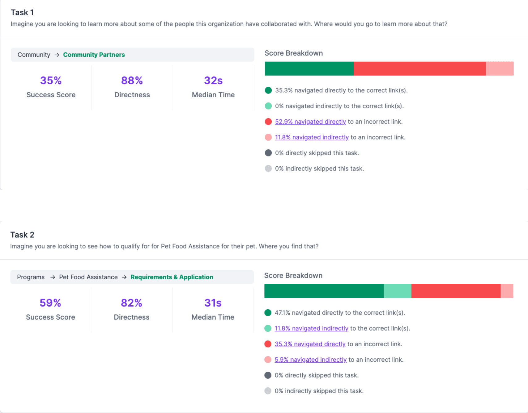

17
17
Participants
Participants

42%
42%
Avg. success rate
Avg. success
rate

64%
64%
Users failed while applying for pet assistance
Users failed while applying for pet assistance
Users expressed that they rely on others for financial decisions due to their lack of knowledge, which results in low self-confidence.
Users expressed that they rely on others for financial decisions due to their lack of knowledge, which results in low self-confidence.
QUALITATIVE RESEARCH
QUALITATIVE RESEARCH
THE DISCOVERY
USER INTERVIEWS
USER INTERVIEWS
USER INTERVIEWS
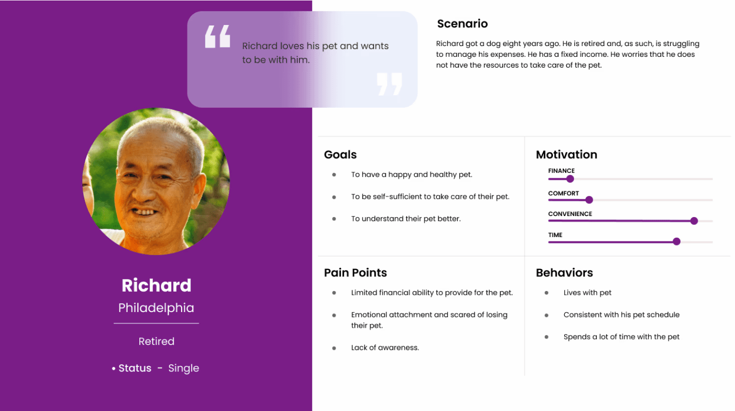
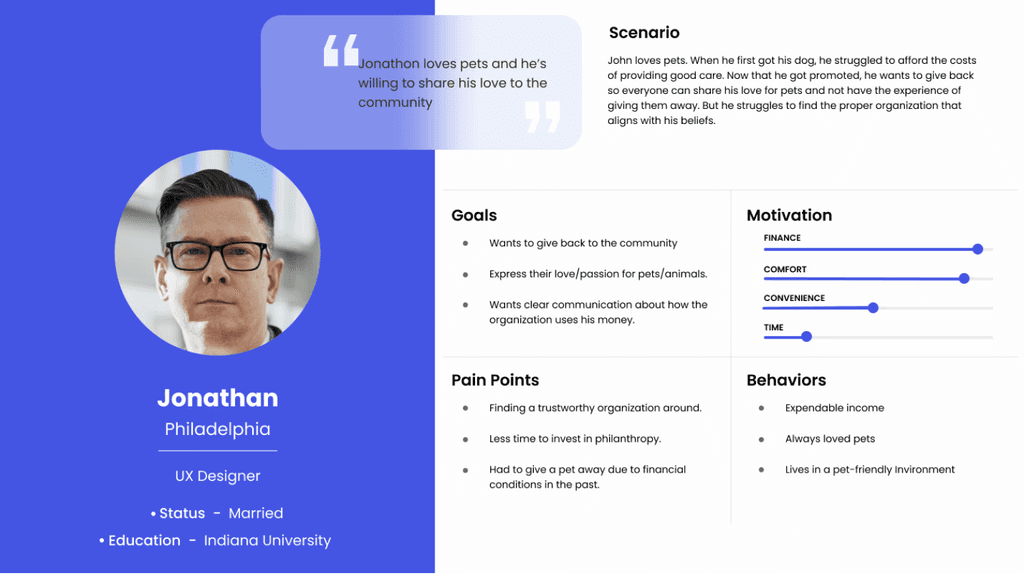
Philadelphia-based pet owners aged 20–55 were interviewed, leading to the development of two user personas. One represents individuals seeking assistance from Sam’s Hope, while the other reflects those interested in supporting the organization. These personas helped shape solutions tailored to the distinct needs of each group.
Philadelphia-based pet owners aged 20–55 were interviewed, leading to the development of two user personas. One represents individuals seeking assistance from Sam’s Hope, while the other reflects those interested in supporting the organization. These personas helped shape solutions tailored to the distinct needs of each group.
We interviewed Philadelphia-based pet owners aged 20-55 and developed two user personas. The first persona represents individuals seeking assistance from Sam’s Hope, while the second captures those interested in supporting the organization. These personas guided us in tailoring our solutions to meet the distinct needs of both groups.


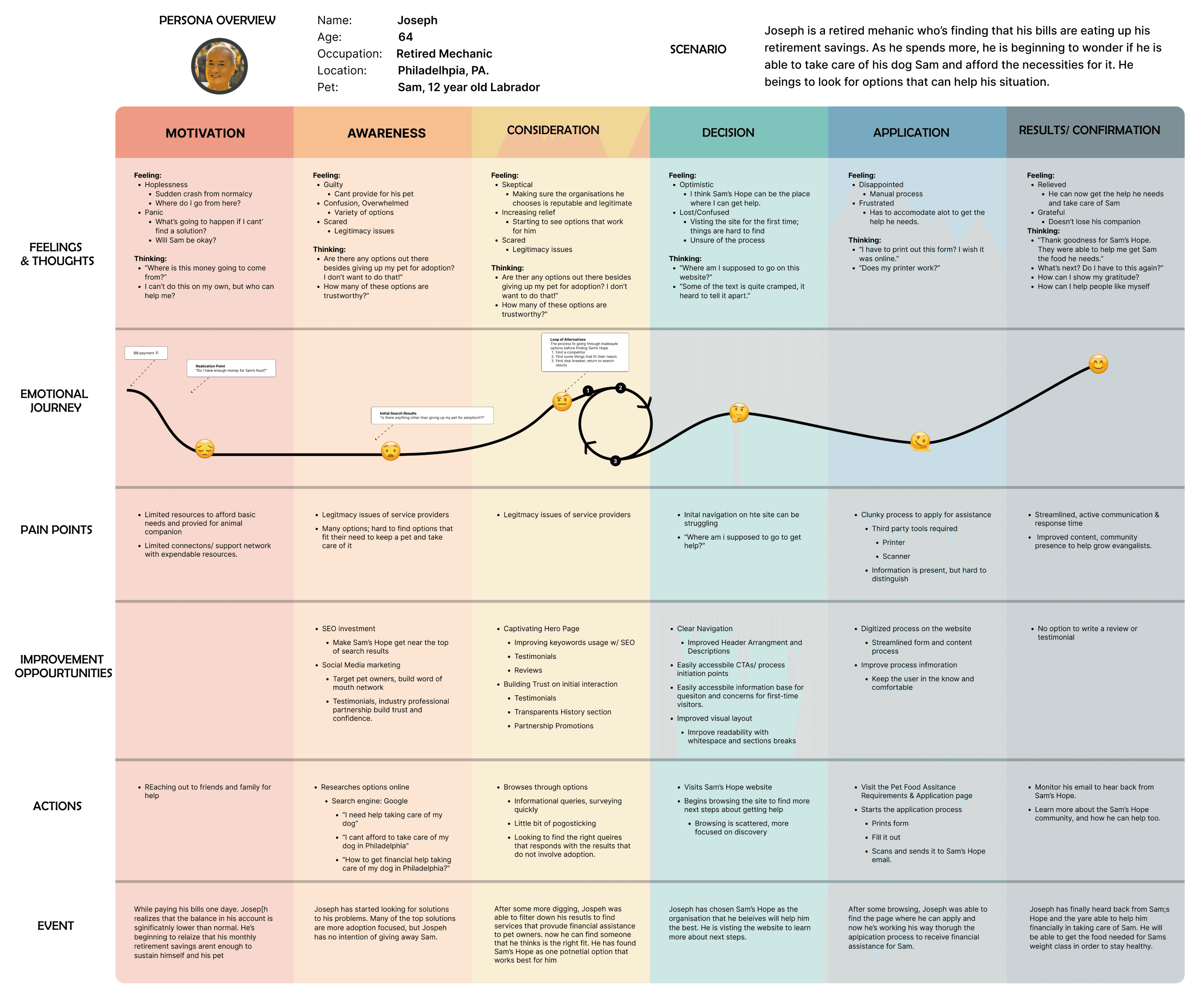
USER JOURNEY MAP
USER JOURNEY MAP
Creating an intuitive user flow ensures a seamless and enjoyable journey through the application. I mapped
out users' steps as they engaged with the app, from selecting advisors to booking sessions and accessing
tailored content. By designing a clear and efficient path, I enhanced the user experience, allowing users to
achieve their financial goals easily. Through this process, I aimed to foster a supportive and empowering
user environment, leading to greater satisfaction and success for the mentees.
Creating an intuitive user flow ensures a seamless and enjoyable journey through the application. I mapped out users' steps as they engaged with the app, from selecting advisors to booking sessions and accessing tailored content. By designing a transparent and efficient path, I enhanced the user experience, allowing users to achieve their financial goals quickly. Through this process, I aimed to foster a supportive and empowering user environment, leading to greater satisfaction and success for the mentees.
Creating an intuitive user flow ensures a seamless and enjoyable journey through the application. I mapped out users' steps as they engaged with the app, from selecting advisors to booking sessions and accessing tailored content. By designing a clear and efficient path, I enhanced the user experience, allowing users to achieve their financial goals easily. Through this process, I aimed to foster a supportive and empowering user environment, leading to greater satisfaction and success for the mentees.

PAIN POINTS
PAIN POINTS
Information is present, but it is hard to distinguish
Information is present, but it is hard to distinguish
Information is present, but it is hard to distinguish
4
Clunky application process
Clunky application process
Clunky application process
3
Confusion since users often asked
“Where am I supposed to go to get help?”
Confusion since users often asked
“Where am I supposed to go to get help?”
Confusion since users often asked “Where am I supposed to go to get help?”
2
Legitimacy issues of service providers
Legitimacy issues of service providers
Legitimacy issues of service providers
1
SCOPE
SCOPE
SCOPE
The project simplified and organized website content, resulting in improved navigation and clarity. UX writing was enhanced across the site and social media platforms, while the application process was digitized to streamline operations and deliver a more user-friendly, accessible experience for applicants.
This project simplified and organized website content, improving navigation and clarity. We enhanced UX writing for the site and social media, and digitized the application process, streamlining operations and ensuring a more user-friendly, accessible experience for applicants.
This project simplified and organized website content, improving navigation and clarity. We enhanced UX writing for the site and social media, digitizing the application process, streamlining operations, and ensuring a more user-friendly, accessible experience for applicants.
This project simplified and organized website content, improving navigation and clarity. We enhanced UX writing for the site and social media and digitized the application process, streamlining operations and ensuring a more user-friendly, accessible experience for applicants.
1
1
Content Streamlining
Content Streamlining
Content Streamlining
Simplify the application process by organizing content, improving navigation, and providing clear information about pet assistance, ensuring users easily access services and resources on the website.
Simplify the application process by organizing content, improving navigation, and providing clear information about pet assistance, ensuring users easily access services and resources on the website.
Simplify the application process by organizing content, improving navigation, and providing clear information about pet assistance, ensuring users easily access services and resources on the website.
2
2
Process Digitization
Process Digitization
Process Digitization
Transform manual workflows into seamless digital processes on the website, improving efficiency, reducing errors, and offering users a streamlined and accessible experience.
Transform manual workflows into seamless digital processes on the website, improving efficiency, reducing errors, and offering users a streamlined and accessible experience.
Transform manual workflows into seamless digital processes on the website, improving efficiency, reducing errors, and offering users a streamlined and accessible experience.
3
3
Improve UX Writing
Improve UX Writing
Improve UX Writing
Explore opportunities to enhance UX writing across the site to improve clarity, build trust, and guide users—especially older adults—more effectively through the donation and application process.
Simplify the application process by organizing content, improving navigation, and providing clear information about pet assistance, ensuring users easily access services and resources on the website.
Explore opportunities to enhance UX writing across the site to improve clarity, build trust, and guide users—especially older adults—more effectively through the donation and application process.
LET'S IDEATE
LET'S IDEATE
THE DISCOVERY
DESIGN SPRINT
DESIGN SPRINT
Brainstorming-get those gears turning!
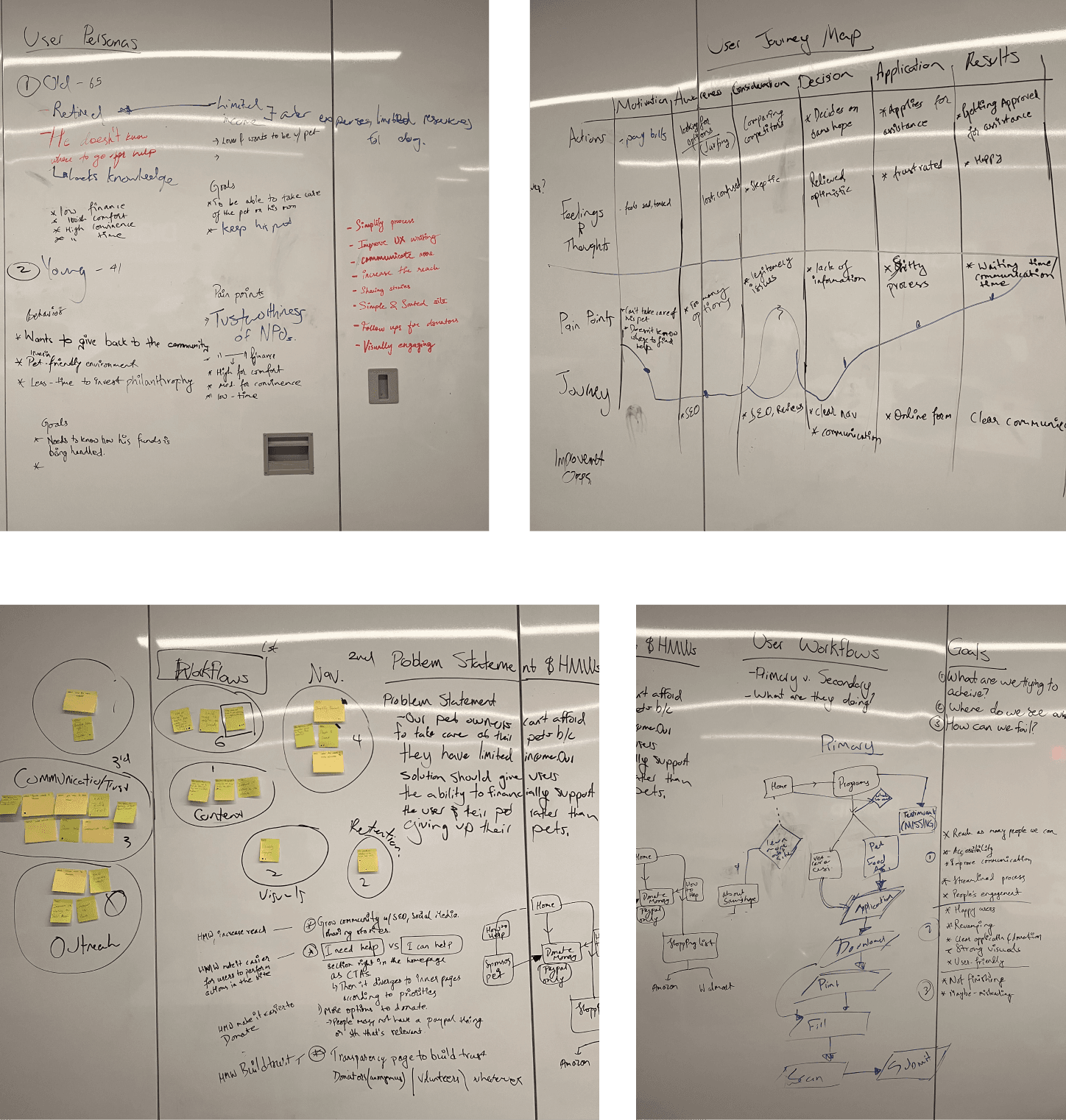
1. Persona and Journey Map Review
- Understand who we’re designing for.
Goal Setting
-What do we hope to achieve?
-What does failure look like?
-Where do we see ourselves at the endof this?
User Workflow
-How does the user navigate the sitenow?
-Where can we focus to improve?


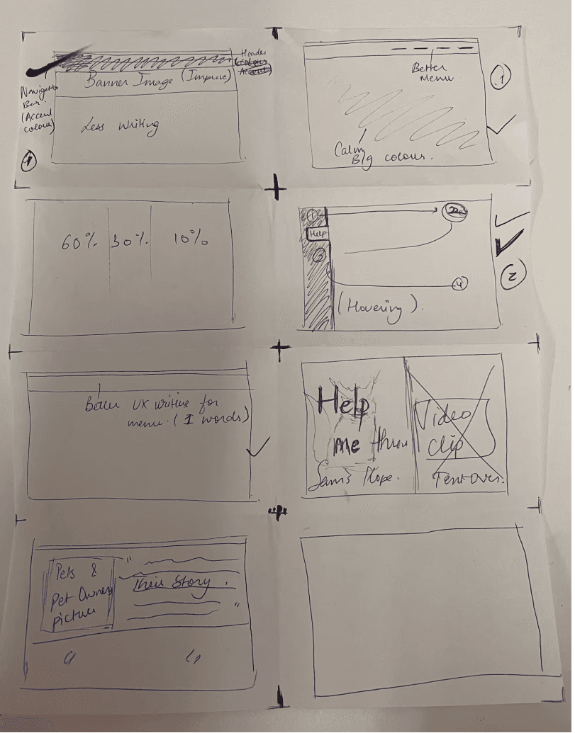
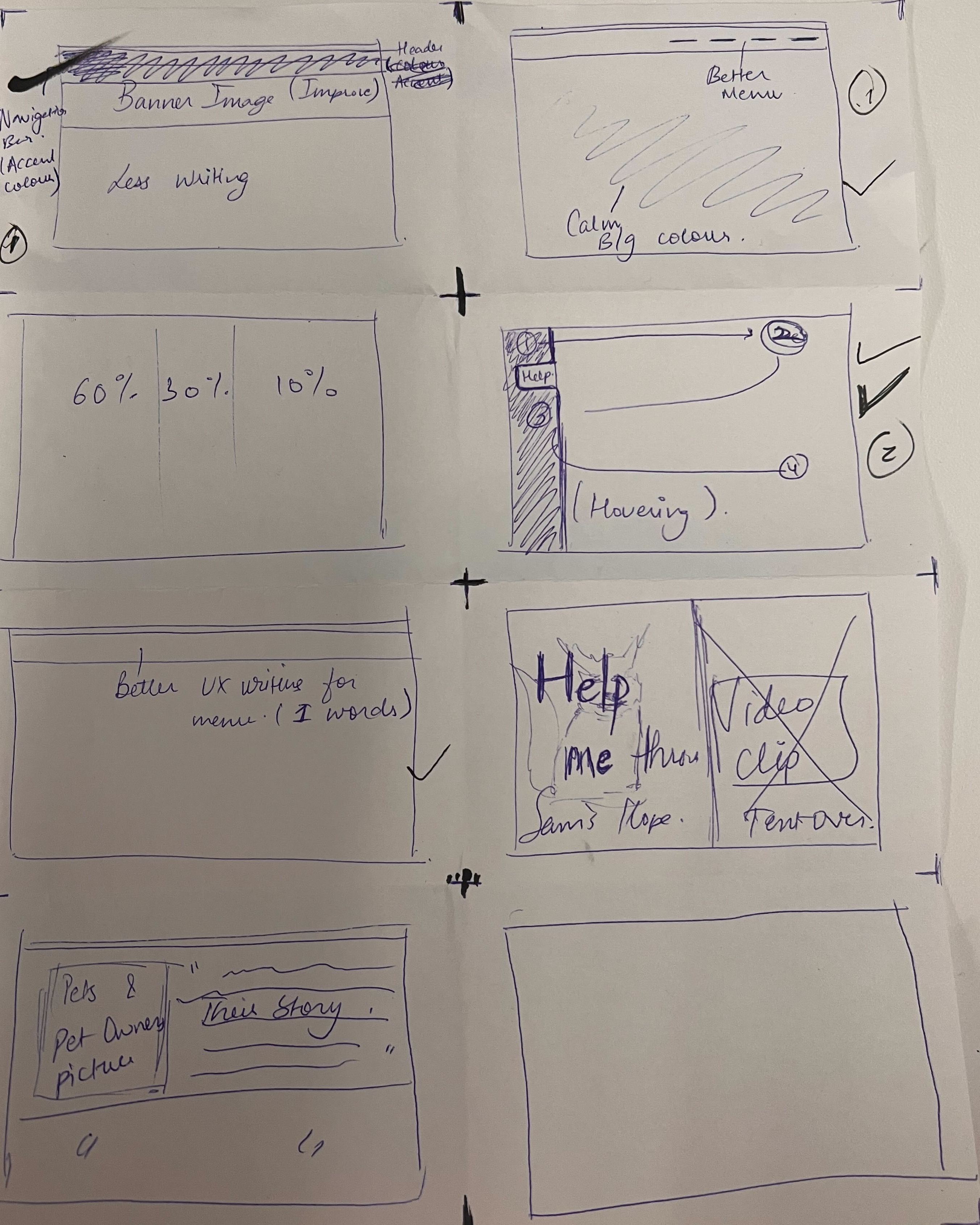
Solution Sketching- Let’s Ideate!
Solution Sketching- Let’s Ideate!
Solution Sketching- Let’s Ideate!
Crazy 8s
8 ideas, 8 minutes
Quantity over Quantity
Converge and vote
Crazy 8s
8 ideas, 8 minutes
Quantity over Quantity
Converge and vote
Crazy 8s
8 ideas, 8 minutes
Quantity over Quantity
Converge and vote


SIMPLIFYING
SIMPLIFYING
THE DISCOVERY
NAVIGATION/SITEMAP
NAVIGATION/SITEMAP
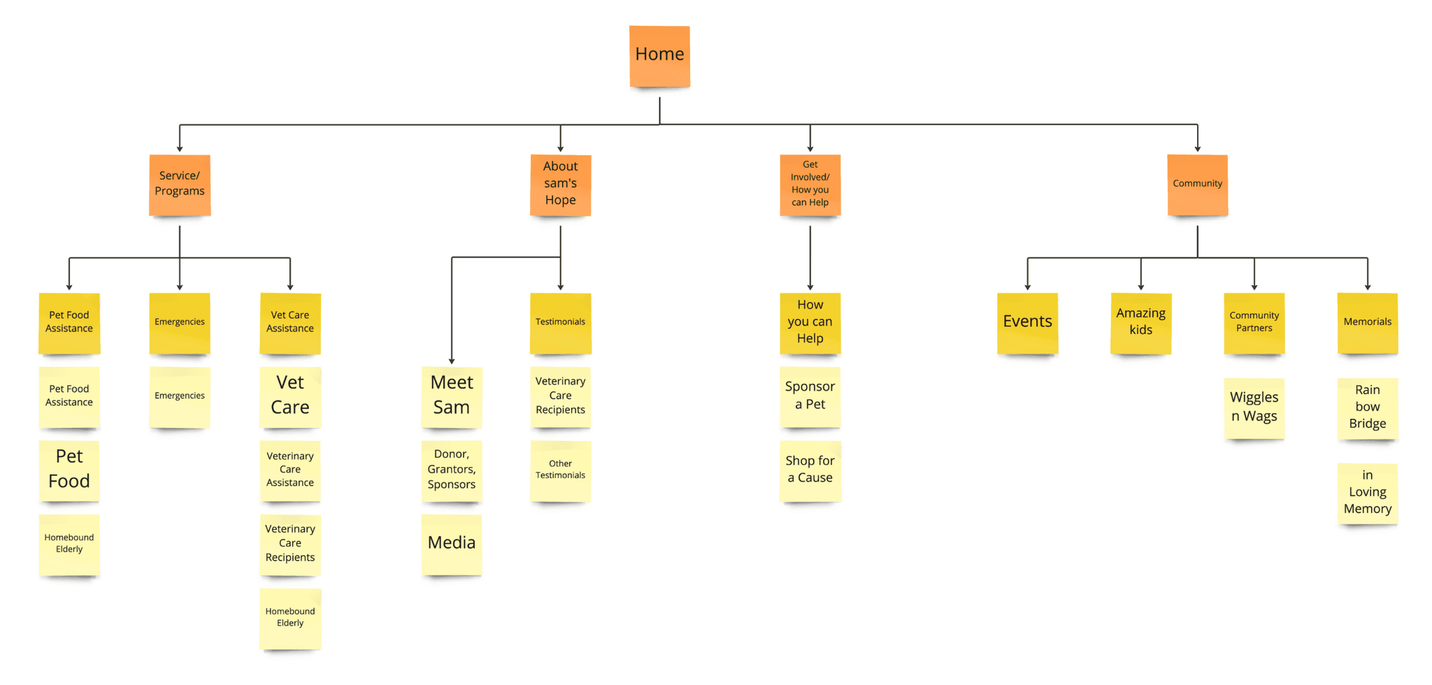
Following insights from card sorting, navigation was simplified by implementing a hierarchical structure with clearly defined content categories. Existing content was reformatted into newly structured pages, improving user flow and accessibility.
Following insights from card sorting, navigation was simplified by implementing a hierarchical structure with clearly defined content categories. Existing content was reformatted into newly structured pages, improving user flow and accessibility.
After simplifying the navigation through card sorting, I implemented hierarchical navigation by organizing content into clearly defined categories. I formatted existing content into new, well-structured pages,
enhancing user flow and accessibility.


Section Page
Section Page
Section Page
New Page
New Page
New Page
Content
Content
Content
CONTENT STRATEGY
CONTENT STRATEGY
CONTENT STRATEGY
Concise for clarity
Concise for clarity
The content is fragmented and not optimized for user needs, with each section isolated, making navigation difficult. By consolidating
similar information and creating a more cohesive structure, we can deliver a concise and streamlined experience that improves usability
and overall engagement.
The content is fragmented and not optimized for user needs, with each section isolated, making navigation difficult. By consolidating similar information and creating a more cohesive structure, we can deliver a concise and streamlined experience that improves usability
and overall engagement.
The content is fragmented and not optimized for user needs, with each section isolated, making navigation difficult. By consolidating similar information and creating a more cohesive structure, we can deliver a concise and streamlined experience that improves usability and overall engagement.
CONTENT AUDITING
CONTENT AUDITING
CONTENT AUDITING
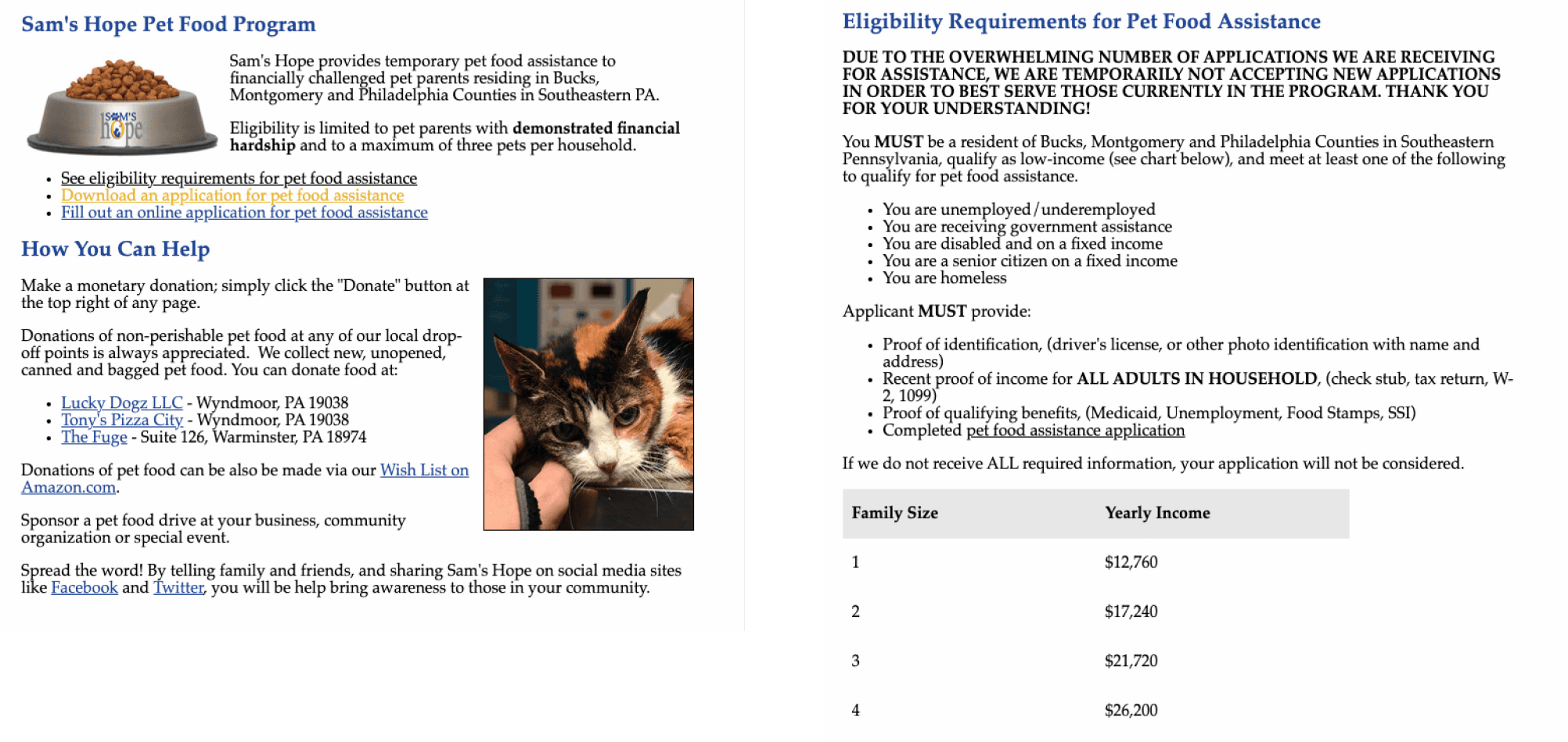
A content audit was conducted to evaluate the website’s existing materials for accuracy and relevance. This process led to the removal of outdated information, ensuring the content was streamlined, clear, and aligned with user needs.
A content audit was conducted to evaluate the website’s existing materials for accuracy and relevance. This process led to the removal of outdated information, ensuring the content was streamlined, clear, and aligned with user needs.
I evaluated the website's existing materials for accuracy and relevance by conducting a content audit. This process helped remove outdated information, ensuring the content was streamlined, clear, and aligned with user needs.
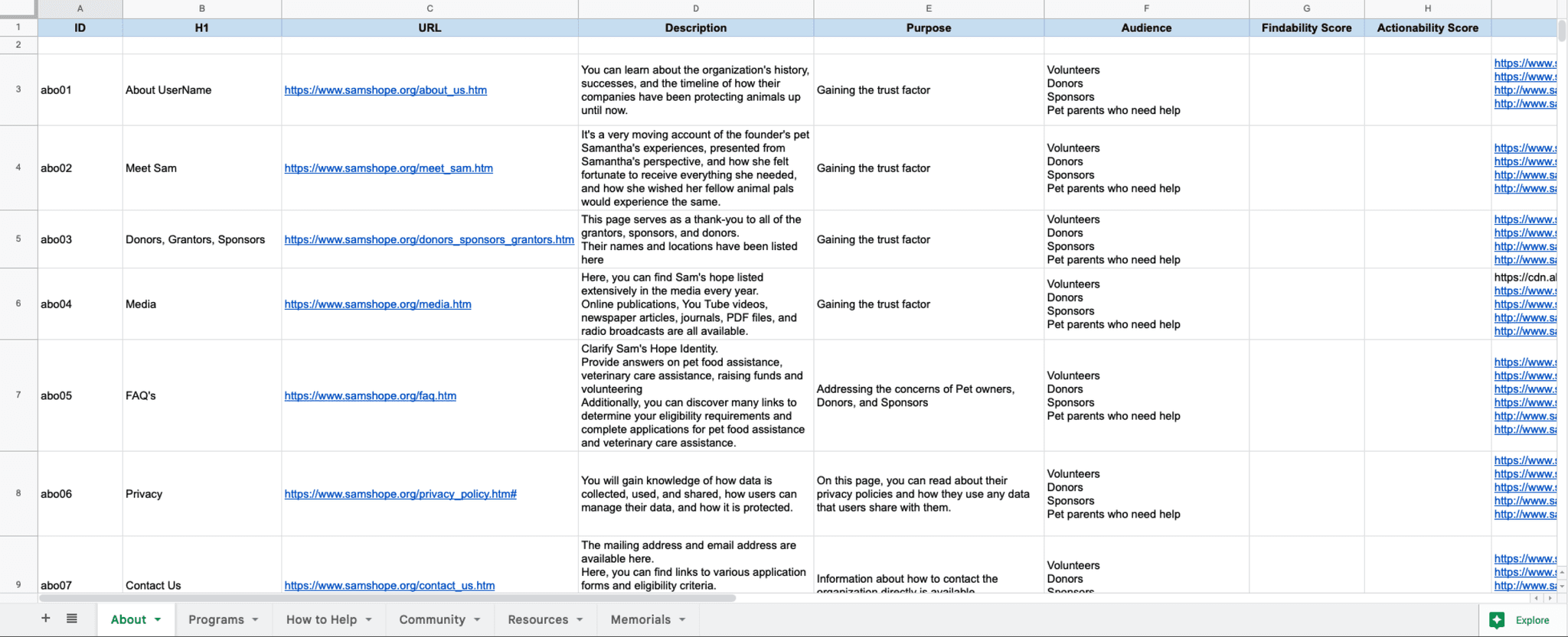


Numbers to gain trust
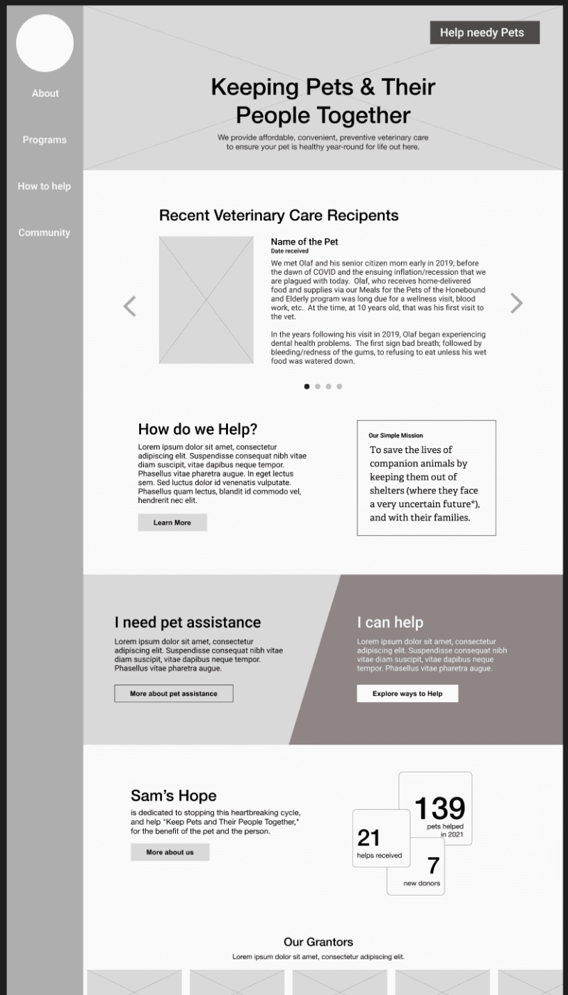
Quick Donate Button
Recent Success Stories
Clear Direction for people who want to
Offer Help or Seek Help
DESIGN
DESIGN
LOW-FI WIREFRAMES
LOW-FI WIREFRAMES
THE DISCOVERY
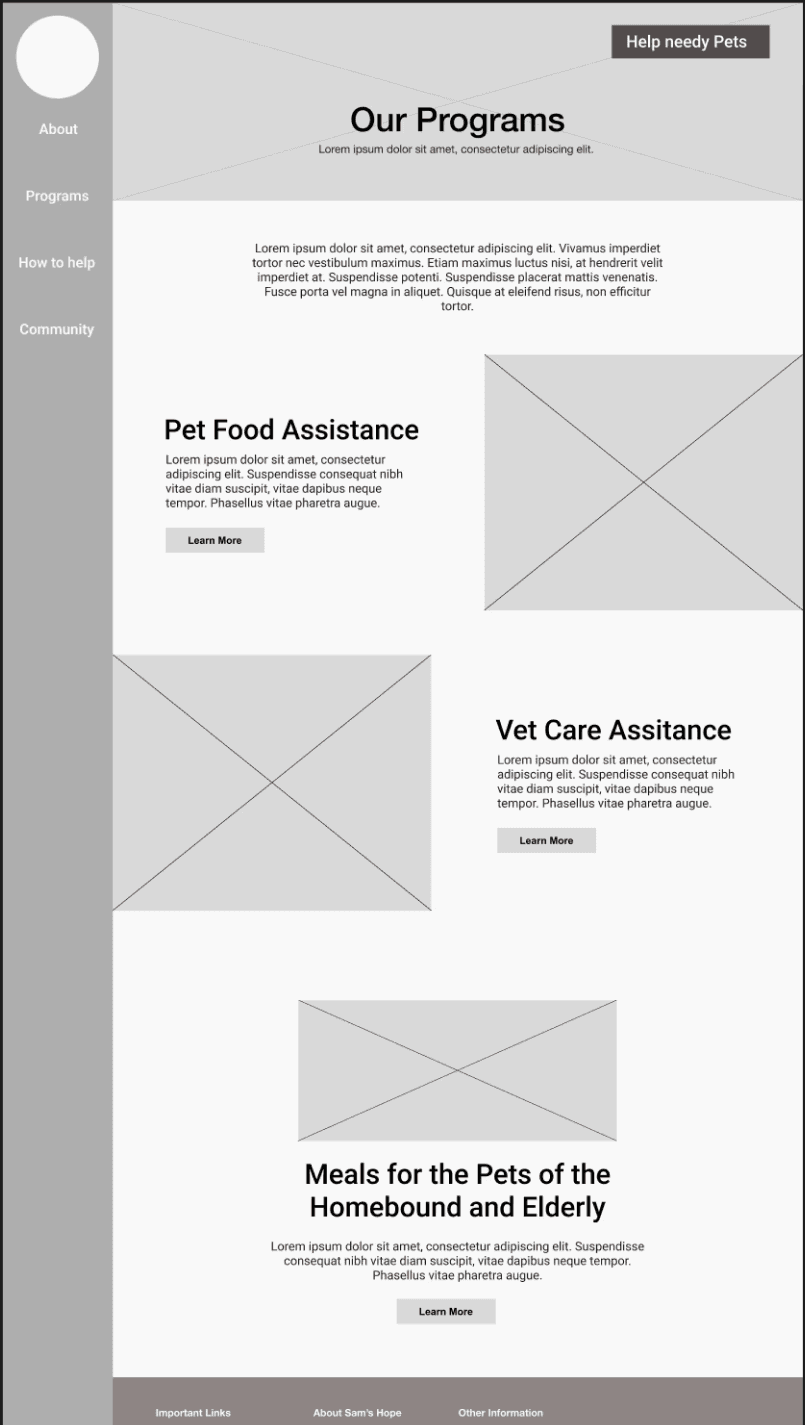

Quick Donate Button
Relatable Pictures
Programs & Details
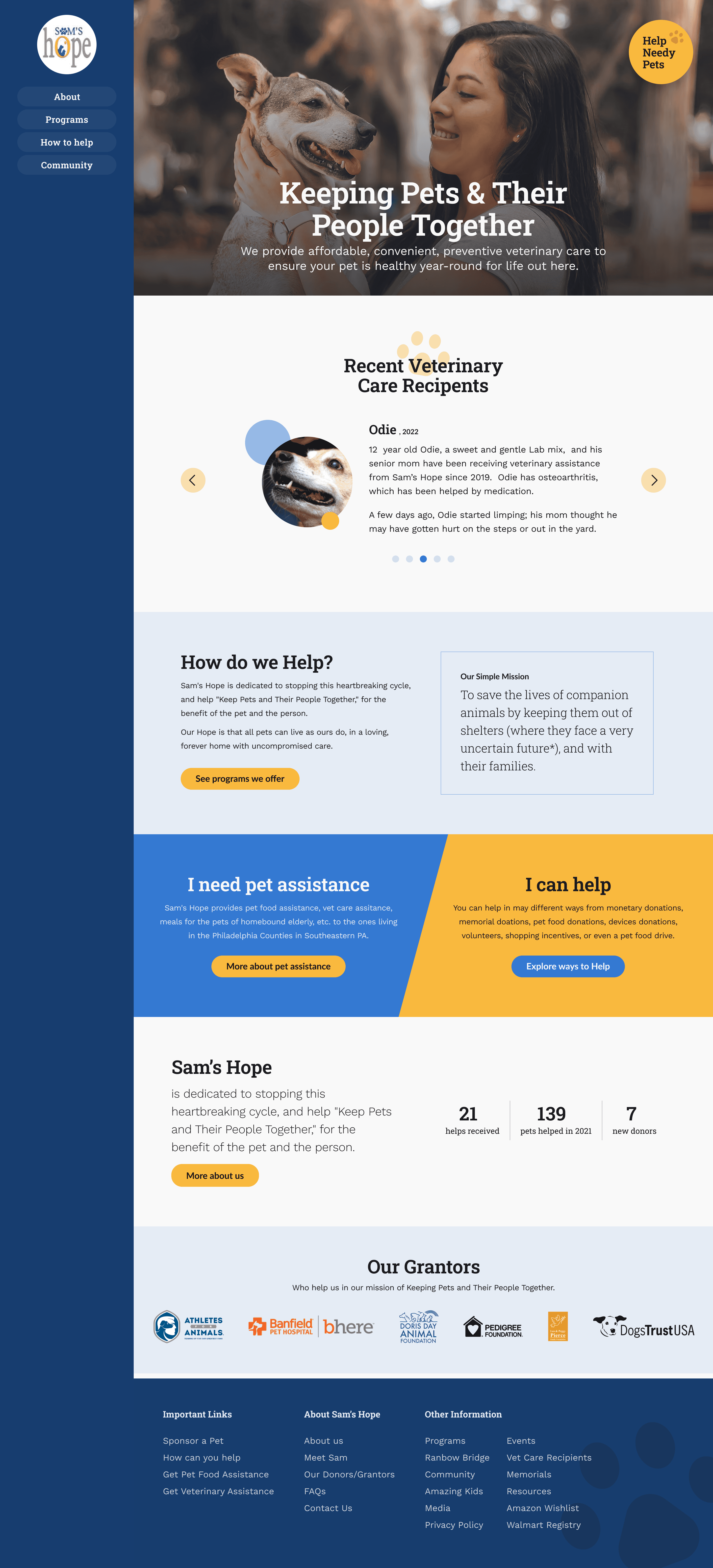
Home Page
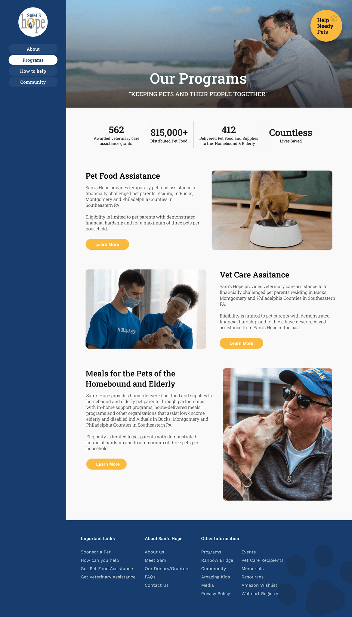
Programs Page
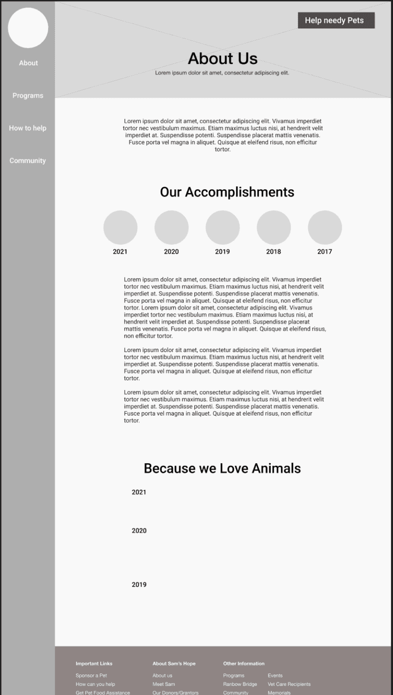
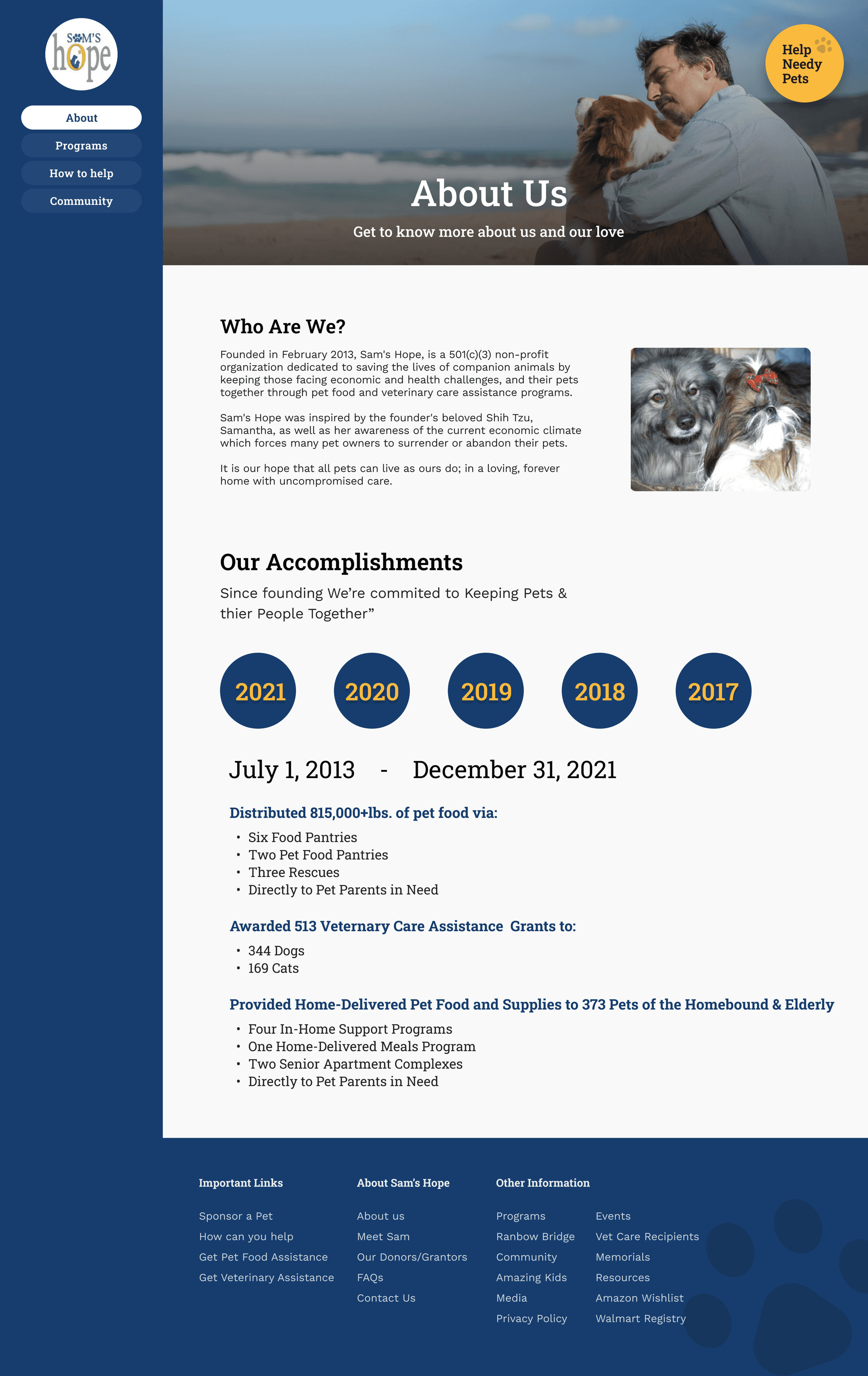
About Page
Accomplishments


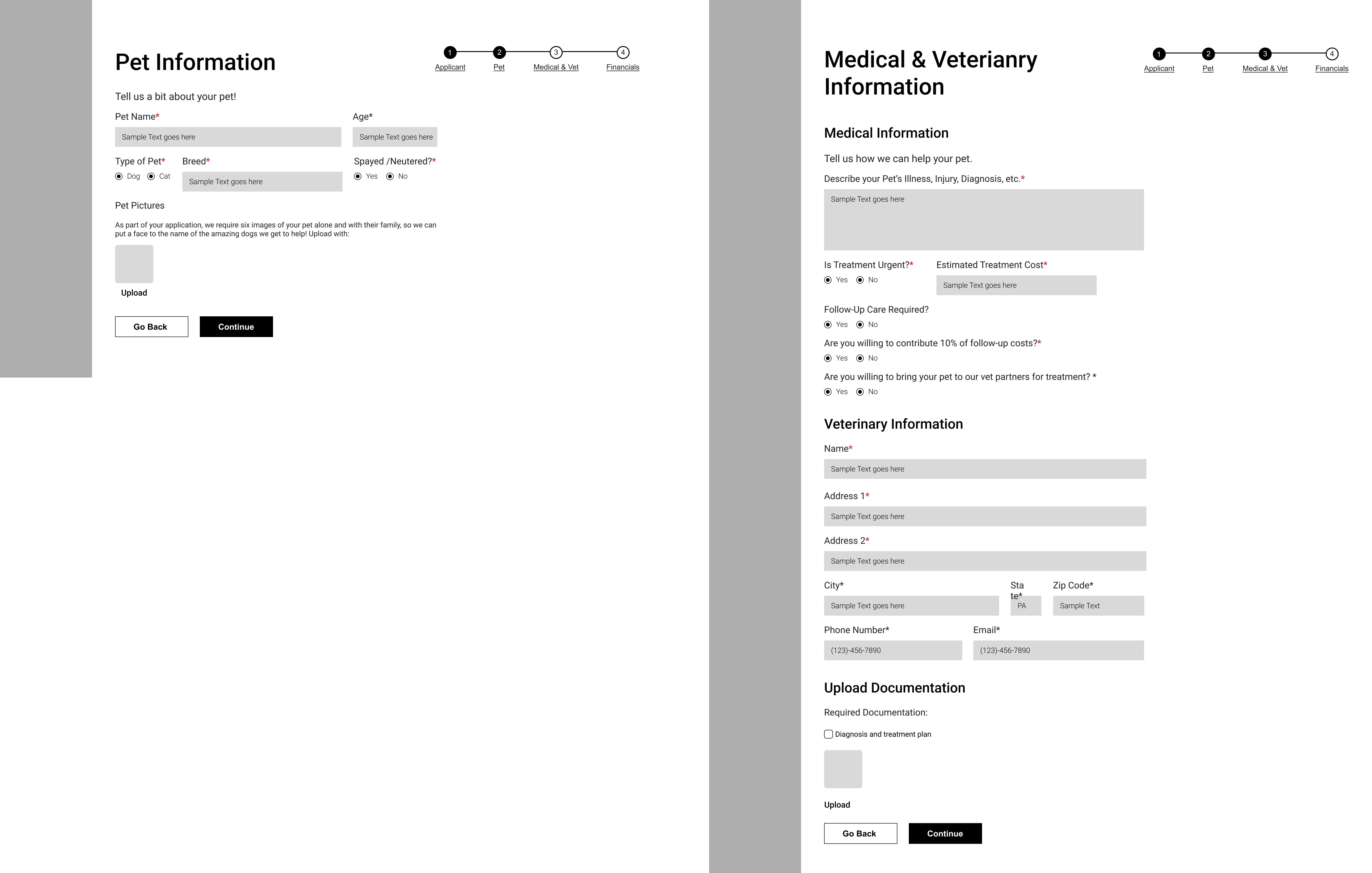


Application Form


STYLE GUIDE
STYLE GUIDE
THE DISCOVERY


HI-FIDELITY
HI-FIDELITY
HI-FIDELITY
HI-FIDELITY
HI-FIDELITY








UPDATED NAVIGATION TESTING
UPDATED NAVIGATION TESTING
UPDATED NAVIGATION TESTING
UPDATED NAVIGATION TESTING
UPDATED NAVIGATION TESTING


TAKEAWAYS
TAKEAWAYS
TAKEAWAYS
TAKEAWAYS
Learned to leverage alternative secondary research methods through stakeholder engagement,
a valuable approach for future projects.
Learned to leverage alternative secondary research methods through stakeholder engagement, a valuable approach for future projects.
Learned to leverage alternative secondary research methods through stakeholder engagement, a valuable approach for future projects.
Gained insight into design sprint structure and management strategies to enhance project
efficiency moving forward.
Gained insight into design sprint structure and management strategies to enhance project efficiency moving forward.
Gained insight into design sprint structure and management strategies to enhance project efficiency moving forward.
NEXT STEPS
NEXT STEPS
NEXT STEPS
NEXT STEPS
The plan involves presenting findings to Sam’s Hope and enhancing usability testing with a
validated user pool to ensure an improved user experience.
The plan involves presenting findings to Sam’s Hope and enhancing usability testing with a
validated user pool to ensure an improved user experience.
The plan involves presenting findings to Sam’s Hope and enhancing usability testing with a validated user pool to ensure an improved user experience.
The plan involves presenting findings to Sam’s Hope and enhancing usability testing
with a validated user pool to ensure an improved user experience.
Implementing a chatbot to enhance communication and streamline user interactions.
Implementing a chatbot to enhance communication and streamline user interactions.

UP NEXT
UP NEXT
UP NEXT
